Figma | Adobe XD | Usability Hub | Optimal Workshop | Procreate | Marvel | Notepad++ | Webflow
Research | IA | Design & Prototyping | Testing | Iterating | Evaluation
At the beginning of the design thinking process I conducted a competitor analysis of several apps which are similar to my approach in order to search and review features that are common standard , unique or add special value to each of these apps. My analysis was focused on the ease of use , navigation and the general structure of the apps. From onboarding to the final usage of various features. While rating the implemented features I was also able to get a deeper look at the user reviews within the app stores and pointed out mentioned strengths and weaknesses.
One-on-one interviews are an efficient and true method of communication between a researcher and user or stakeholder. There are different main types of interviews, each of which is used in a different context and with different goals. For my project, I decided to conduct directed interviews , which are the most common sort. These are typical question-and-answer interviews, where I was able to ask specific questions. This can be useful when conducting interviews with a large number of users, or when looking to compare and contrast answers from various users.
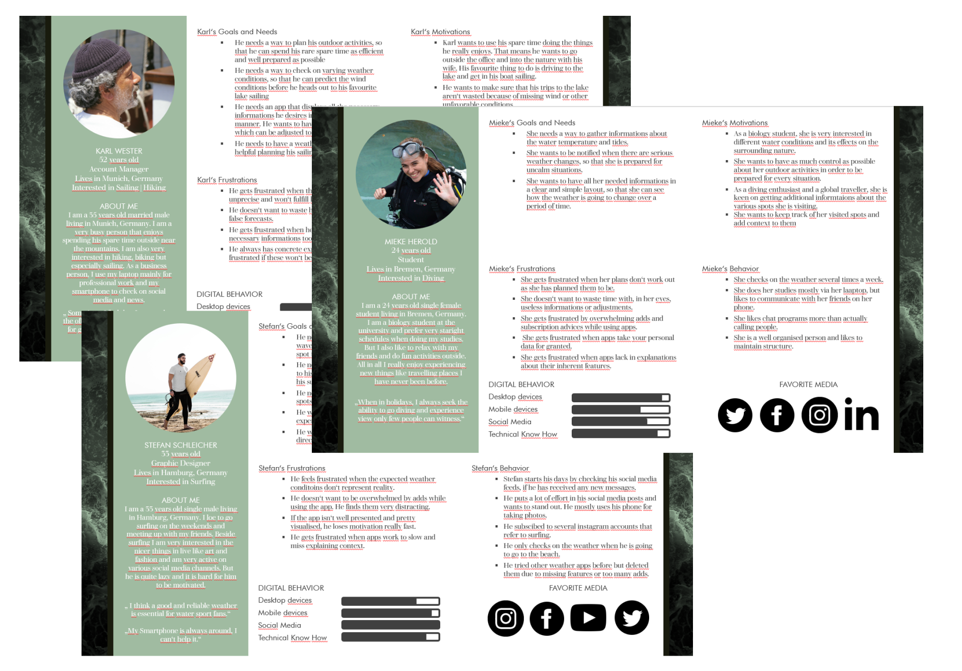
Based on the user interviews I have created three user personas, which cover certain aspects like motivations, behaviors and frustration points. This way I was able to maintain the focus on the user.
Users need a way to look up reliable and detailed weather reports in order to predict the weather. Knowing the intensity of waves and wind is essential for any water sport enthusiast to keep activities safe. But users often feel frustrated at the use of current weather apps because they lack in guidance and only offer a bulky handling. They miss a clear display of relevant information within a user friendly interaction. Users need a companion that displays reliable and precise weather data, so that they can experience activities well prepared without worrying about the inconsistency of the weather.
By providing users with an app, that allows them to predict the weather, wind and tides precisely at every point of interest, we can enhance their saftey and well being at outdoor activities like sailing, surfing or fishing. The weather reports need to be updated frequently up to just-in-time, in order to stay reliable. The navigation should also be easy to use but also well balanced in its functionality. That means it is necessary to include all the important features like weather maps, anemometers and scale of waves, to provide the user with all the needed information in an user friendly manner.
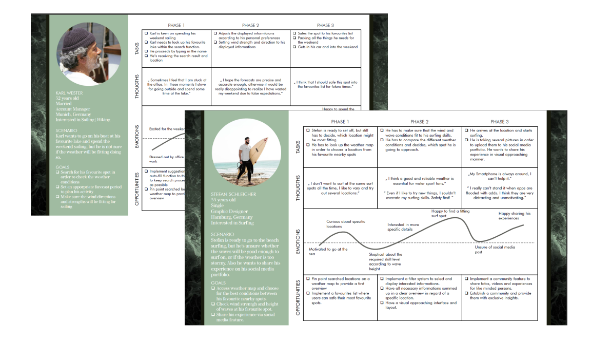
With my personas in mind, I wanted to showcase their experience and journey as they check the weather and plan their acitivities. Creating user journeys helped me even better understand potential users and to point out opportunities for supportive features and services.
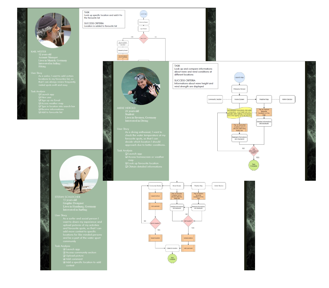
With user flows I layed out the setps each user has to go through in order to fulfill their goal. In doing so, it was essential to maintain a swift and easy flow without detours.
Business goals can never be fulfilled if you can't meet the needs of your customers. I commenced the discovery phase, with doing researches to find out which problems users have with current applications and products in order to formulate possible solutions. In doing so, I would be able to develop a new product faster, while spending less ressources and add more value to stakeholders. Knowing the needs and desires of users will be essential in order to design an experience that provides true value and acknowledges user needs.
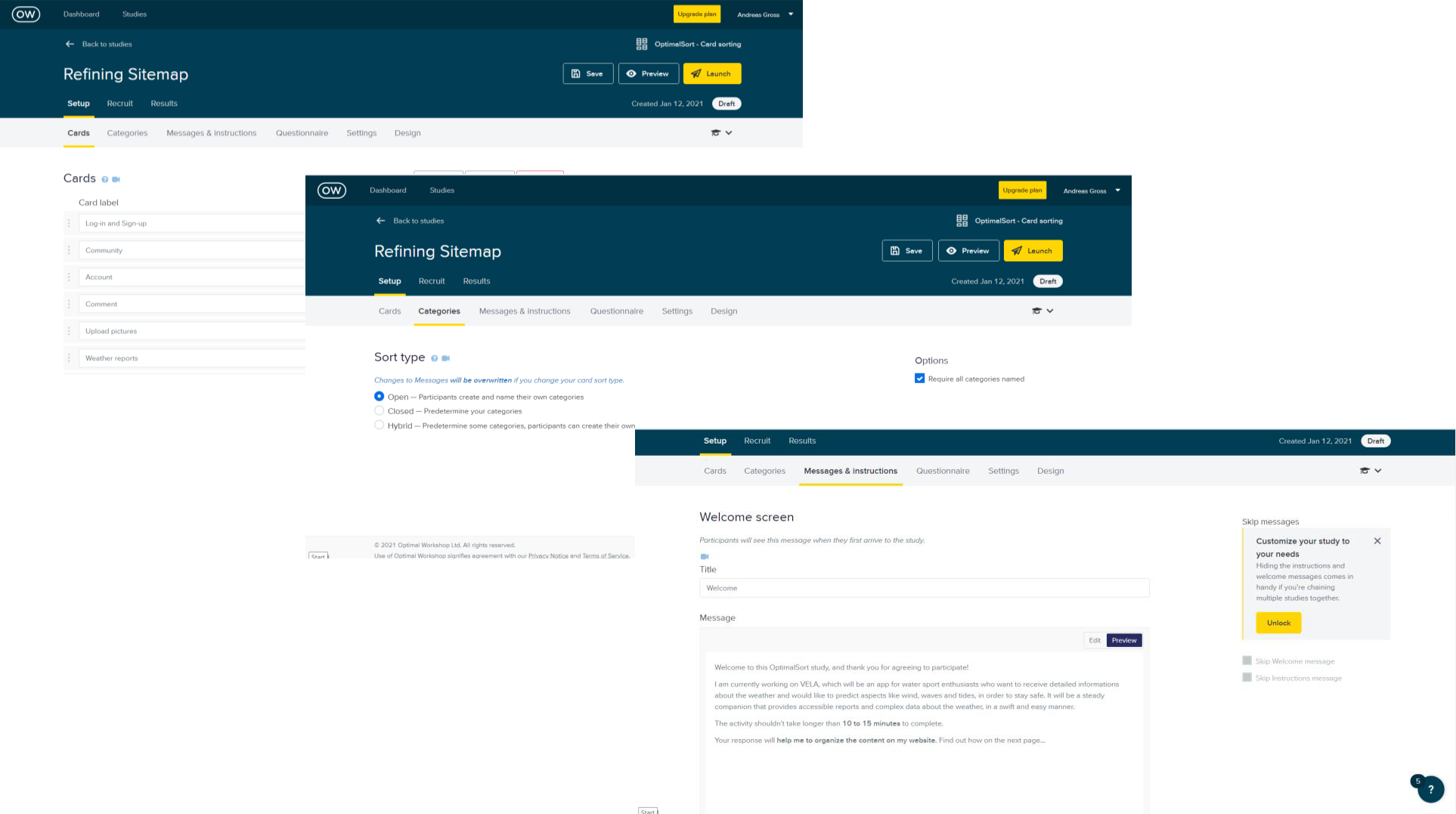
Setting up the card sorting process helped me to set and refine the sitemap. This is important to get a contextual understanding of how users tend to sort features and assets of a product.
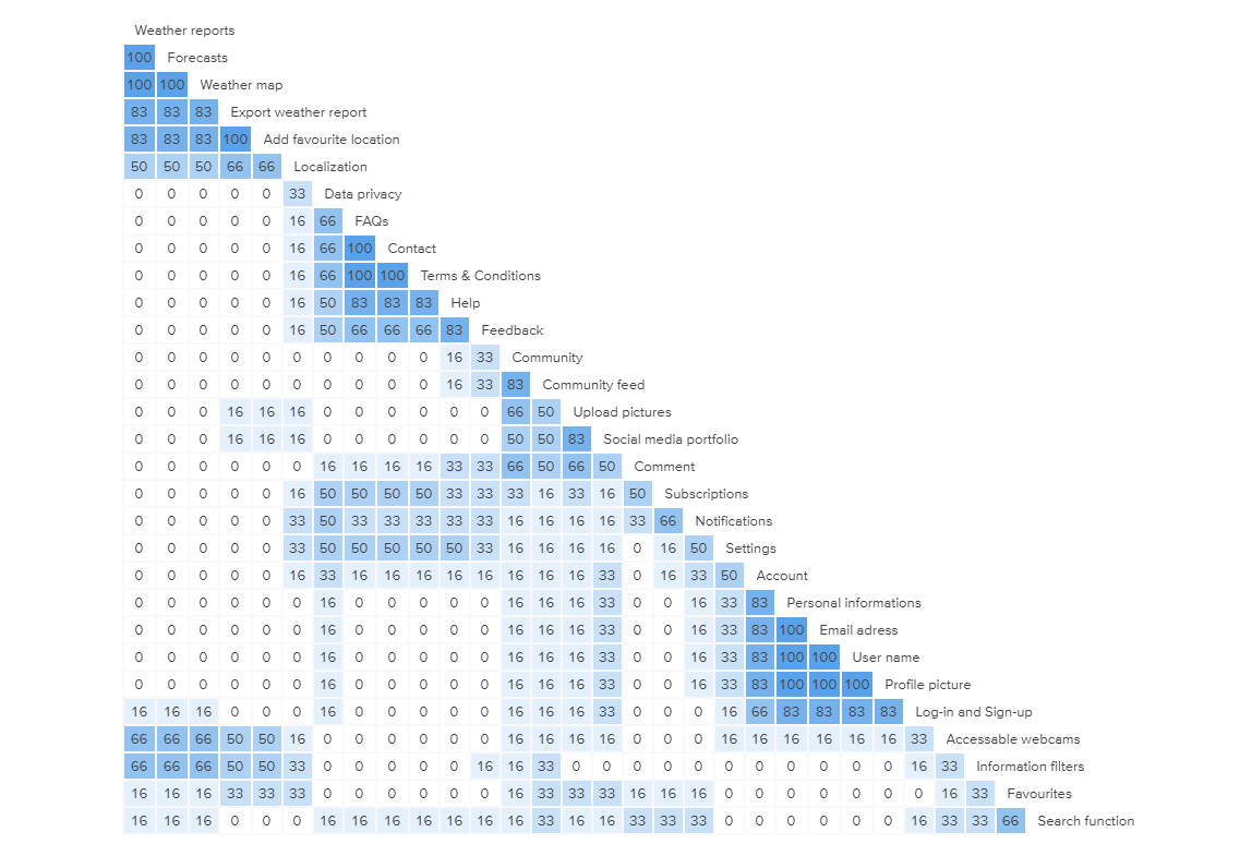
This view shows the proportion of participants who grouped cards within a similar category. For each pair of cards, the intersecting cell shows the percentage of participants who grouped these cards together. The similarity matrix was a great starting point to identify potential groupings and helped me cluster related features.
Based on the previously conducted researches, user interviews and cardsorting, I was able to create a refined sitemap which includes features in order to solve the formulated problems while fulfilling the needs of users based on the interviews and user stories. So I clustered several features into goups, which will be contextually benefitial and easy accessible for users.
.png)
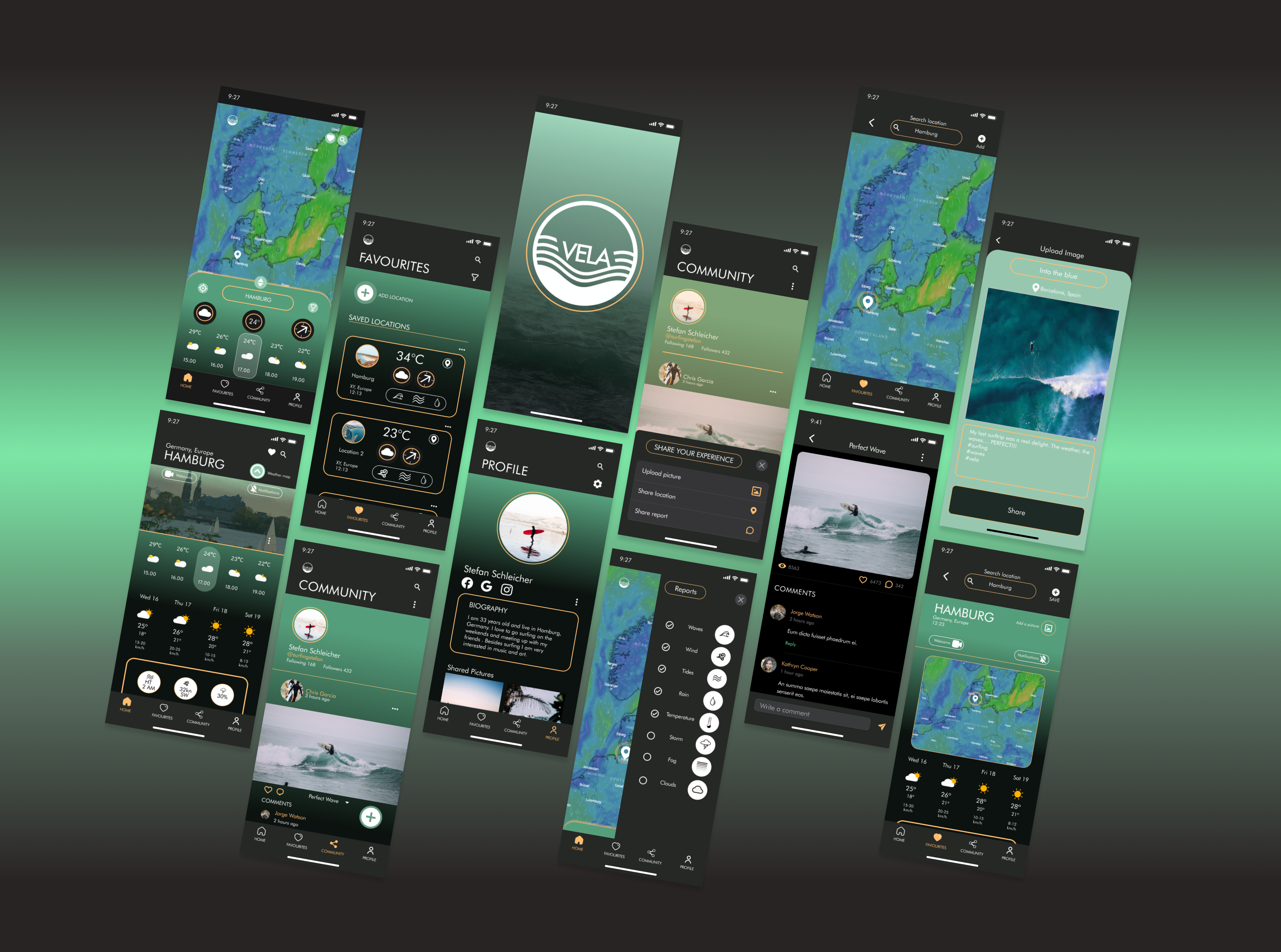
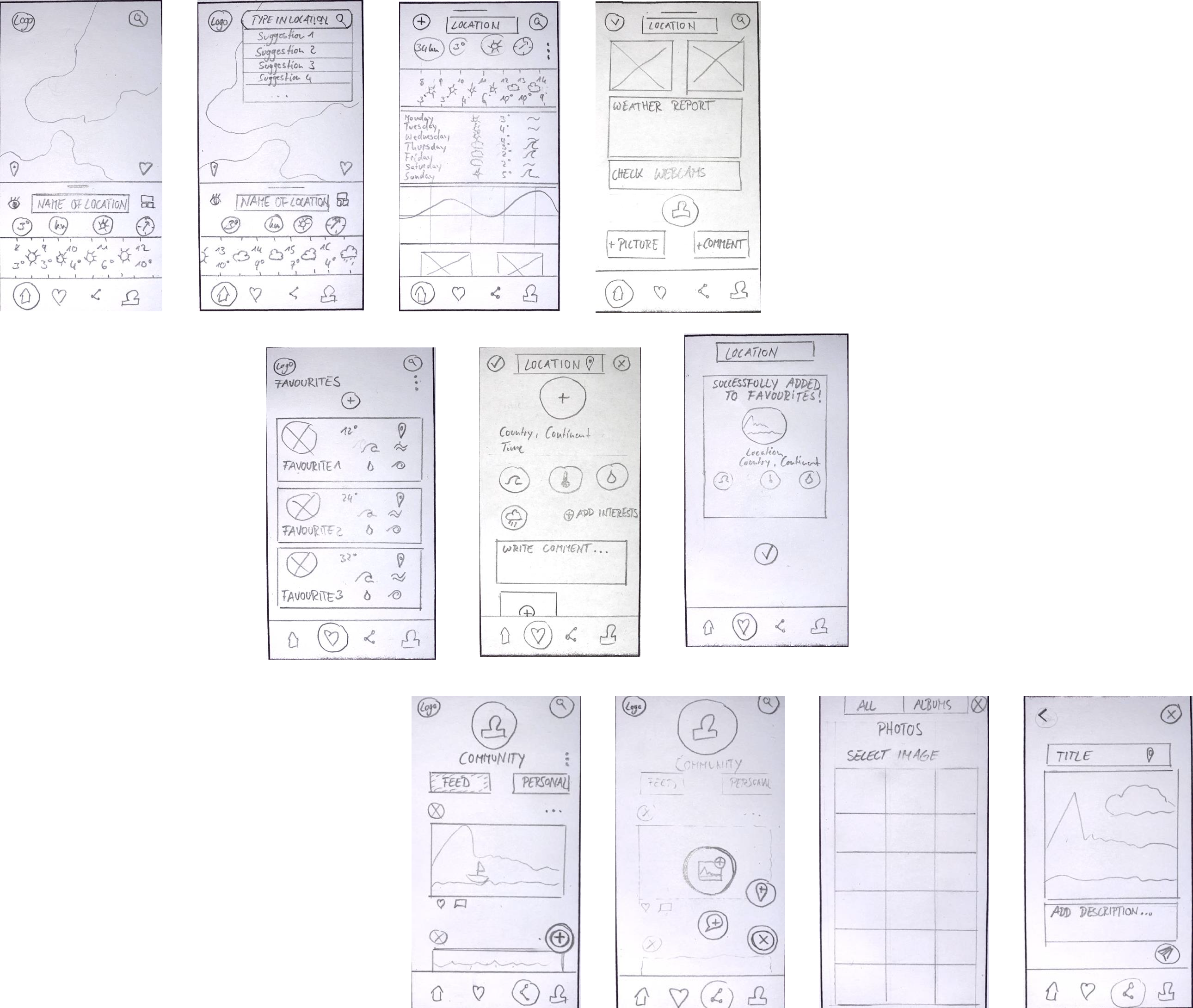
The goal was to create a solid foundation I can build upon and improve with upcoming iterations . I started by sketching the first wireframes with pen and paper. Those are simple but allow a lot of creativity when defining and demonstrating the directions of the product.
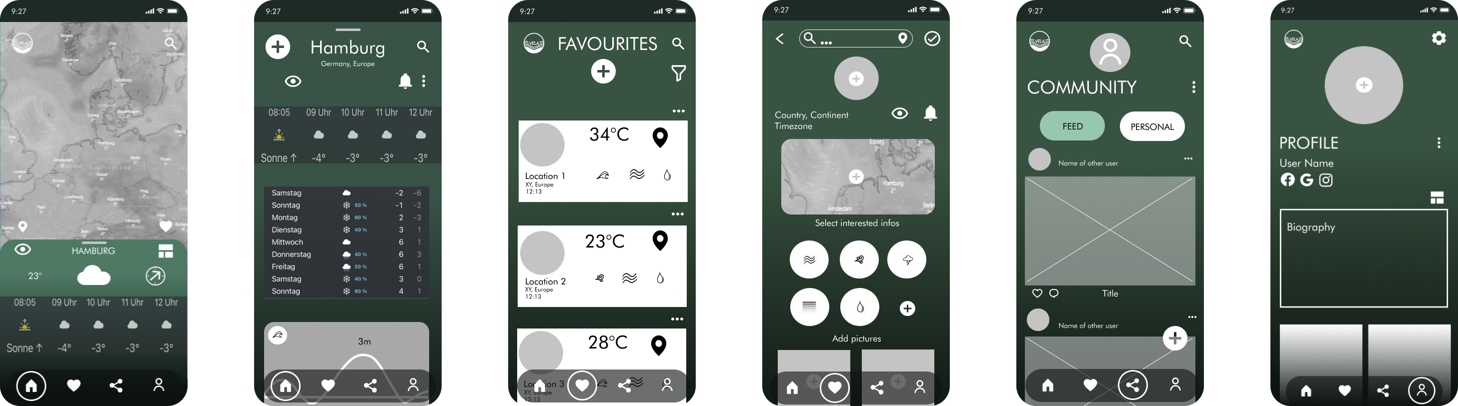
In the next step I wanted to reshape the sketches and create first digital wireframes. I added more details to the existing wireframes in order to get closer to a real app design, which led to the creation of mid fidelity wireframes as the next iteration of VELA. The new version was clearly more detailed and provided a solid basis to proceed design development, as I was able to fully use the potential of digital design tools.
By adding further details and putting more thought into the general structure such as the allocation of icons, info boxes and buttons, I created the first high fidelity prototype of VELA ready to be tested.
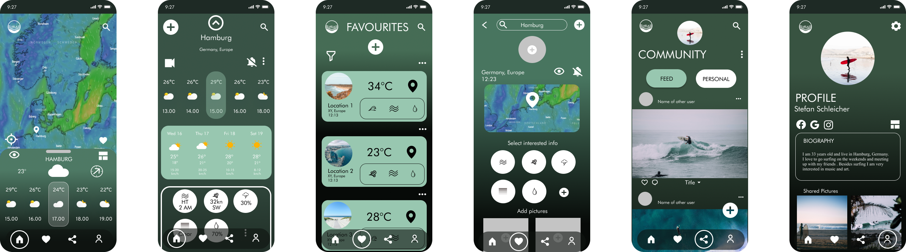
I‘ve invited participants to join Zoom meetings, where the usability test have been conducted. I recorded the sessions with the inherent record function of Zoom itself. I have also moderated one session in person and recorded the process with my iPhone. All of the other participants received a link to my figma based hi-fidelity prototype via mail and were able to interact without major problems. I then summarized the issues, observations and quotes into a rainbow sheet, so I was able to make further adjustments and solve the mentioned issues.
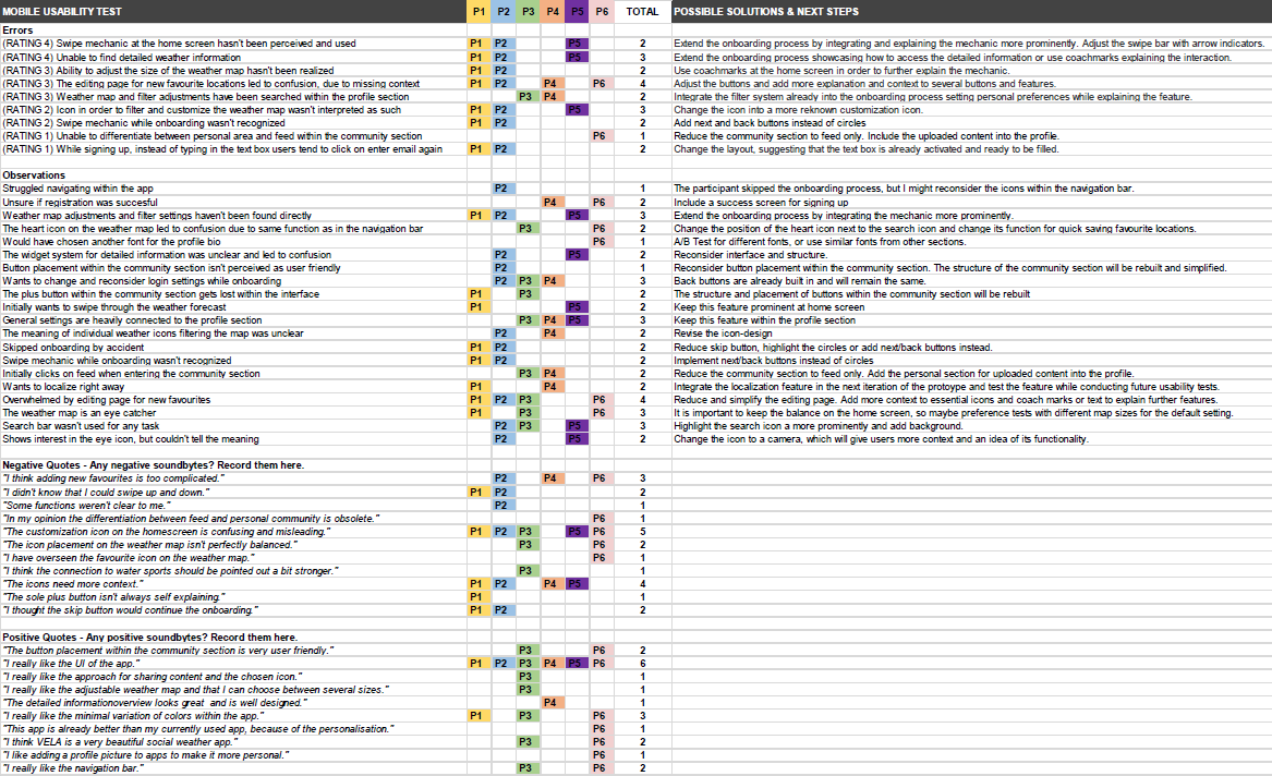
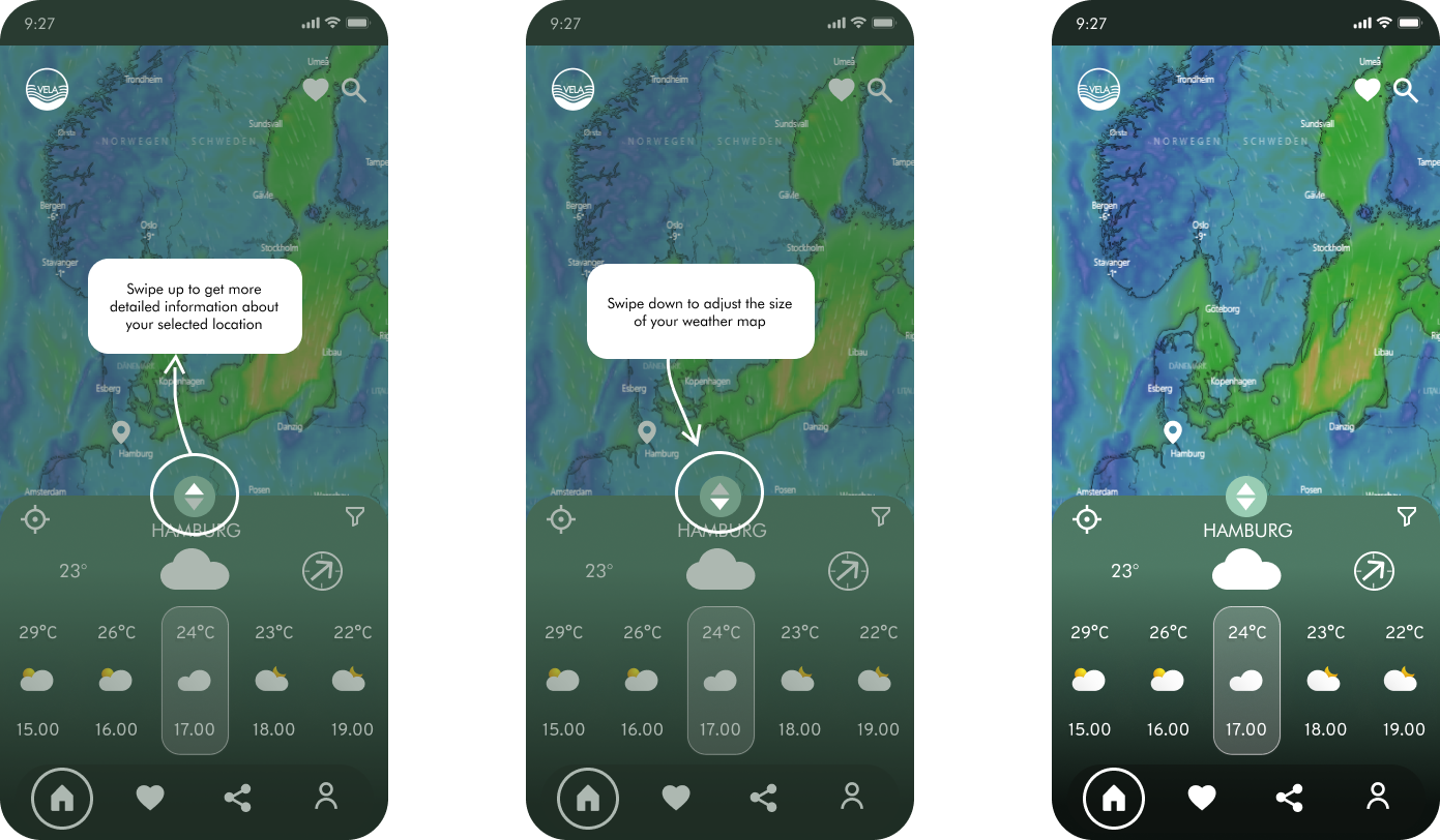
Swipe mechanic at the home screen hasn't been perceived and used. Some users didn't know that they were able to adjust the weather map with help of the swipe bar.
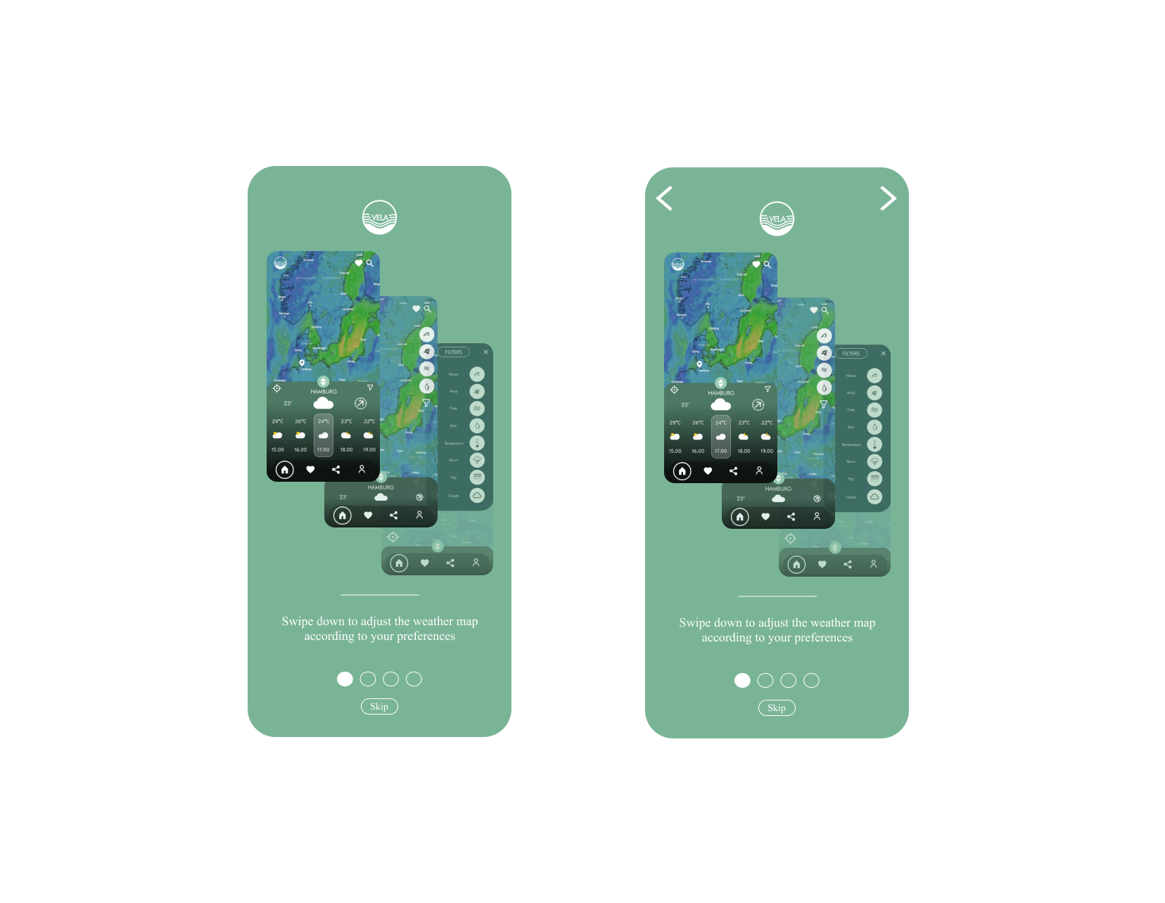
Because this is an essential feature and adds a lot to the user experience, I decided to use coachmarks after the onboarding in order to further explain the mechanic. I also integrated this mechanic prominently into the onboarding process, but since the onboarding process can be skipped I still felt the necessaty to introduce users to this specific feature via coachmarks.
Swipe mechanic while onboarding wasn't perceived and used by some participants
In order to solve this issue I have added arrow icons, indicating that users can navigate forwards and backwards if they want to
In general, the usability tests were a major success. Sure, there have been several points that had to be reconsidered, but all of my participants felt very comfortable during the sessions and enjoyed using the app. I was also able to gather interesting insights and suggestions on how to improve the product in order to make it more user friendly. All of the participants understood the general purpose of the app and the value it will provide. With that being said , all of my participants had a connection to water sports which validates and increases the quality of my findings. Even though the navigation and interaction wasn‘t clear for all of my participants, I do think that the general approach underlines and supports the idea of the app . The swipe mechanic will need more guidance which is now provided by the onboarding process and coachmarks. Based on my findings I was able to impove the VELA app.
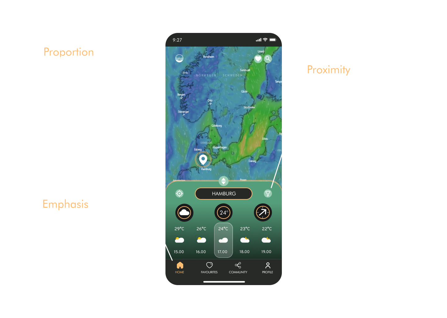
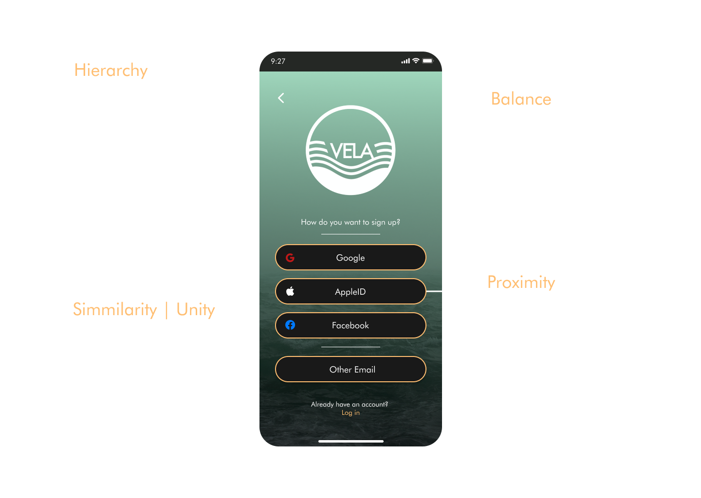
In order to further polish and refine the wireframes I tested the prototype according to the gestalt laws and principles of design. This way I was able to further improve the current wireframes and add thoughtful design structure.
Beside conducting several usability tests , I gathered further feedback from peer designers within a design collaboration in order to gain further insights from another UXD perspective . An additional accessibility analysis lastly provided me with detailed information about what might be problematic for the general usability of the product and which features needed further adjustments to meet the recommended guidelines. These changes finally led to the current high fidelity wireframes of VELA.
By giving users the ability to find the next best location according to their personal water sport preferences, would be motivating for traveling users and people that generally want to learn about new places to pursue their hobbies. Users will benefit from filtered and fitting surf locations, sailing turns and diving spots .
The hypothesis will be supported by user interviews in order to get quality data that will provide insights on which assets should be considered while designing an additional feature. Usability tests and further preference tests will validate the hypothesis when users think that this feature is valuable such as easy and engaging to use
The search function takes a big part within the app and interacts with every core feature of the product. Therefore it is an essential part and should be given high priority. The current design fulfills the purpose very well, but it can be improved by giving a little bit more work into the interaction design. The webcam features need more specific improvements aswell,because this section will display available webcams at theinterested locations.
Further user testing will focus on specific improvements and not the whole variety of features. So, the test goals will be formulated in order to validate the improvement. Therefore it is important to separate between minor changes and major changes . Minor improvements will be tested through A/B and preference tests, while major improvements might require further usability testings in order to maintain an overall good usability.
If you like what you see and want to work together, get in touch!